新年快到了,想在博客上面添加一些福字的喜庆元素,同让这些元素能动起来。于是想到了波纹效果,现在使用css3能够轻松实现波纹扩散的动画特效,使用到了CSS动画中的keyframes关键帧。同时配合放大、旋转、翻转等动作让整体效果更加丰富。

文章目录涟漪波纹扩散动画css3核心代码在此基础上,我还可以增加鼠标移入放大效果鼠标移入旋转效果鼠标移入放大+旋转效果鼠标移入翻转效果演示地址:
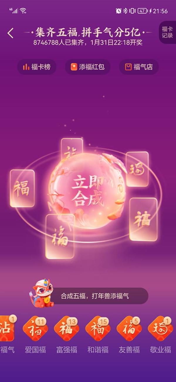
一转眼就要过年了,支付宝一年一度的集五福活动正在如火如荼的进行中,博客怎么的也得添加点喜庆元素。于是就在iconfont里面找了一些福字,来完善喜庆氛围。
前些日子研究了波纹扩散的动画,正好结合福字来做一些改变。
最终使用的效果如下,鼠标hover上去之后,福字顺时针180°,同时稍微放大一些,寓意“福到家了”。

特别提醒,扫上面的福字更加容易得到敬业福哦,你看我就扫到了。
涟漪波纹扩散动画css3核心代码.box { box-sizing: border-box; position: relative;.ripple:before { content: ""; animation: ripple 2s ease-out infinite; border: 1px solid #d8b3b3; border-radius: 50%; top: 0; bottom: 0; left: 0; right: 0; box-sizing: border-box; position: absolute; opacity: 0; .ripple:after { content: ""; animation: ripple 2s 1s ease-out infinite; border: 1px solid #d8b3b3; border-radius: 50%; top: 0; bottom: 0; left: 0; right: 0; box-sizing: border-box; position: absolute; opacity: 0; @keyframes ripple { 0% { transform: scale(1.3); opacity: 0.4; 25% { transform: scale(1.8); opacity: 0.3; 50% { transform: scale(2.3); opacity: 0.2; 75% { transform: scale(2.8); opacity: 0.1; 100% { transform: scale(3.3); opacity: 0;

在此基础上,我还可以增加鼠标移入放大效果.box { transition: all 0.9s ease;.ripple:hover { transform: scale(1.15);

鼠标移入旋转效果.ripple:hover { transform: rotate(180deg); /*顺时针旋转*/.ripple:hover { transform: rotate(-180deg); /*逆时针旋转*/鼠标移入放大+旋转效果.ripple:hover { transform: scale(1.15) rotate(180deg);


鼠标移入翻转效果.ripple:hover { transform: rotateX(180deg); /*垂直翻转*/.ripple:hover { transform: rotateY(180deg); /*左右翻转*/


最后提前祝大家新年快乐,福到博友家!
演示地址: VIEW DEMO